
Volatility & Derivatives
In this post we give an introduction to the Heston model which is one of the most used stochastic volatility model. It assumes that the

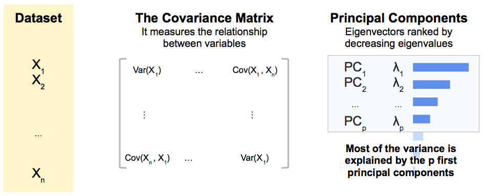
Principal Component Analysis (PCA) is a statistical method for reducing the dimension of a dataset.
It is a popular method for analysing a large dataset, increasing the interpretability of the data without losing much information.
It does that by maximizing the percentage of total variance explained with new uncorrelated variables, the principal components, which are linear combinations of the initial variables.
They are the eigenvectors of the covariance matrix with the highest eigenvalues.
Let’s start with a first simple example.
We consider a dataset composed of 18 elements, circles with close size, and different colors.
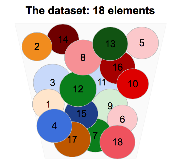
If we remove the circles from the box and we reorder them a bit, we identify some common common characteristics.
Circles have different sizes, but it is a second order characteristic compared to the one listed above.

So with the four following principal components, we are likely to explain most of the information in our dataset:

With a dimension of 4 instead of 18, we were able to explain most of the variance in our universe.
The principal components are new, uncorrelated variables, linear combinaisons of the initial variables, which maximize the total variance explained.
It can be shown that the first principal axes are the eigenvectors of the covariance matrix with the highest eigenvalues.
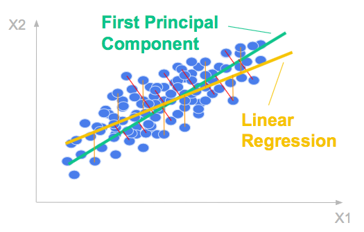
Let’s consider a 2 dimensional dataset. The scatter plot below shows the relationship between the two variables.
The first principal component is the direction of greatest variation.
It is formed by minimizing the mean-squared distance between all variables and their projections.

The mean squared distance tells you how much variance the first principal component does not explain, it is explained by the second one, in the orthogonal direction.

The ordinary least squares regression line is formed by minimizing the mean-squared error in the y-direction.
It is in general different from the first principal component which is formed by minimizing the mean-squared distance between all variables and their projections. It it the (orthogonal) total least square line.
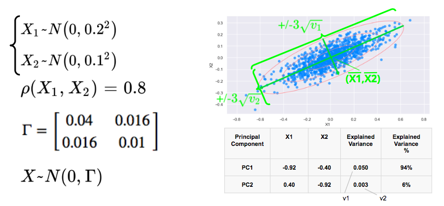
We consider two correlated gaussian variables X1 and X2, with zero mean, 0.2 and 0.1 standard déviations respectively, and a correlation of 0.8.
We simulate below 1000 data points and plot below the scatterplot with the 1, 2, 3 standard deviations. The 3 standard deviations ellipse encloses 98.9% of the data points.
The first eigenvector, with the highest eigenvalue points in the direction of the first axis of the ellipses with the longest axis while the second eigenvector points in the direction of the sortes axis.
In this example, 94% of the variance is explained by the first principal component.
Below is the Python code used to for the simulations:
#import libraries:
from matplotlib.patches import Ellipse
import matplotlib.pyplot as plt
import numpy as np
import matplotlib.pyplot as plt
import seaborn as sns; sns.set()
from sklearn.decomposition import PCA

#simulation bivariate normal variables
sd1 = 0.2
sd2 = 0.1
corr = 0.8
correl = np.array([[1.0,corr],[corr,1.0]])
diag_sd = np.array([[sd1,0.0],[0.0,sd2]])
covar = diag_sd.dot(correl.dot(diag_sd))
X = np.random.multivariate_normal([0,0],covar,1000)

#Principal Component Analysis
#fit
pca = PCA(n_components = 2)
pca.fit(X)
#Explained variance (eigenvalues)
var_explained = pca.explained_variance_
print("Explained Variance:")
print(var_explained)
#PCA components (eigenvectors)
print("PCA Components:")
pca_components = pca.components_
print(pca_components)

#Plot
ax = plt.subplot(111, aspect = 'equal')
x = X[:, 0]
y = X[:, 1]
#Ellipse
for j in range(1, 4):
    ellipse = Ellipse(xy=(np.mean(x), np.mean(y)),
                  width = np.sqrt(var_explained[0]) * j * 2, height = np.sqrt(var_explained[1]) * j * 2,
                  angle = np.rad2deg(np.arccos(abs(pca_components[0, 0]))),color = 'lightcoral')
    ellipse.set_facecolor('none')
    ax.add_artist(ellipse)
plt.rcParams["figure.figsize"] = (10,5)
#Scatter plot
plt.scatter(x, y, alpha = 0.7, color = 'dodgerblue')
plt.xlabel('X1')
plt.ylabel('X2')
#arrows for principal components
for i in range(0, 2):
    var_explained = pca.explained_variance_[i]
    pca_components = pca.components_[i]
    pca_components_len = pca_components * 3 * np.sqrt(var_explained)
    arrowprops = dict(arrowstyle = '->', linewidth = 4, color = 'limegreen')
    ax.annotate('', pca.mean_ + pca_components_len , pca.mean_ - pca_components_len, arrowprops = arrowprops)
plt.axis('equal');
plt.show()Principal Component Analysis in Finance
Save 10% on All Quant Next Courses with the Coupon Code: QuantNextBlog10
For students and graduates: We offer a 50% discount on all courses, please contact us if you are interested: contact@quant-next.com
We summarize below quantitative finance training courses proposed by Quant Next. Courses are 100% digital, they are composed of many videos, quizzes, applications and tutorials in Python.
Complete training program:
Options, Pricing, and Risk Management Part I: introduction to derivatives, arbitrage free pricing, Black-Scholes model, option Greeks and risk management.
Options, Pricing, and Risk Management Part II: numerical methods for option pricing (Monte Carlo simulations, finite difference methods), replication and risk management of exotic options.
Options, Pricing, and Risk Management Part III: modelling of the volatility surface, parametric models with a focus on the SVI model, and stochastic volatility models with a focus on the Heston and the SABR models.
A la carte:
Monte Carlo Simulations for Option Pricing: introduction to Monte Carlo simulations, applications to price options, methods to accelerate computation speed (quasi-Monte Carlo, variance reduction, code optimisation).
Finite Difference Methods for Option Pricing: numerical solving of the Black-Scholes equation, focus on the three main methods: explicit, implicit and Crank-Nicolson.
Replication and Risk Management of Exotic Options: dynamic and static replication methods of exotic options with several concrete examples.
Volatility Surface Parameterization: the SVI Model: introduction on the modelling of the volatility surface implied by option prices, focus on the parametric methods, and particularly on the Stochastic Volatility Inspired (SVI) model and some of its extensions.
The SABR Model: deep dive on on the SABR (Stochastic Alpha Beta Rho) model, one popular stochastic volatility model developed to model the dynamic of the forward price and to price options.
The Heston Model for Option Pricing: deep dive on the Heston model, one of the most popular stochastic volatility model for the pricing of options.
In this post we give an introduction to the Heston model which is one of the most used stochastic volatility model. It assumes that the

In the previous post (link) dedicated to the pricing of defaultable bonds with a reduced form model, we saw how to price a zero coupon

The Merton Jump Diffusion (MJD) model was introduced in a previous article (link). It is an extension of the Black-Scholes model adding a jump part